

There is a lack of thoughtful information architecture which makes the website difficult for users to locate important information regarding offered programs.
How might we redesign the website to better serve Fernside’s mission and retain better enrollment rates?
The team consisted of three members. My individual responsibilities were:
Additionally, I assisted in the definition, ideation, and lo-mid fidelity prototyping processes
We began by creating a proto persona of a woman who is navigating the grieving process after the loss of her parent while also helping her children navigate their own grief. Her pain points included having to dig for resources, prioritizing everyone else’s emotional health, and being unsure about details of available resources.

A large part of our influences on this redesign were from analysis of 6 similar non-profit grief support centers, in addition to 4 stakeholder interviews.
Additionally, we ran user tests on usability and navigability of the live website with 5 users in order to find existing pain points.
Many of the other grief centers prioritized their mission more heavily than Fernside. Several organizations’ website also included a calendar feature, some more successfully than others.
Most of the other centers also included an FAQ section, which Fernside lacked. Two of the centers focused heavily on language inclusivity, with translation options available for various sections of their website.

Our stakeholder interviews revealed some insight into how the Fernside website and programs are used versus how the Dougy Center, and highlighted some room for growth and improvement for Fernside.
The Dougy Center tracked their enrollment success at 75%, whereas Fernside sits around 50% enrollment success.
For both centers, referrals were most commonly given by schools, healthcare partners, and word of mouth.
Fernside stakeholders remarked that the website is a low referral state currently.

We ran user tests on the live Fernside website to highlight some common pain points within the site.

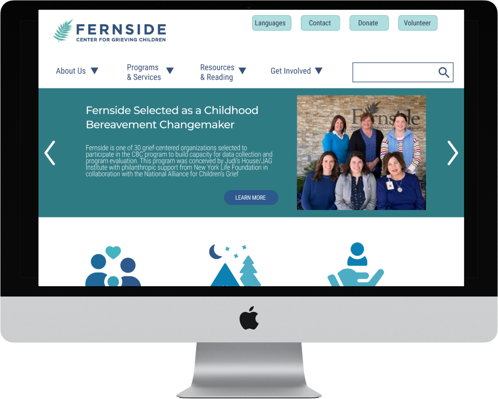
We began with redesigning the site map for the webpage.


Based on our proposed sitemap, we designed a new top navigation menu for the website.


Based on our proposed sitemap, we designed a new top navigation menu for the website.

The existing website colors did not pass the WCAG Accessibility standards. We modified the color palette to bring the website within accessibility standards.


We asked 5 users to navigate the redesigned mobile webpage to find the About Fernside, Support Groups, and Enrollment pages within the site. Users utilized a combination of the top and bottom navigation as well as the icons within the body of the page to navigate each task.
Each member of our team sketched out our ideas for the redesign of the app, using a mobile-first approach.


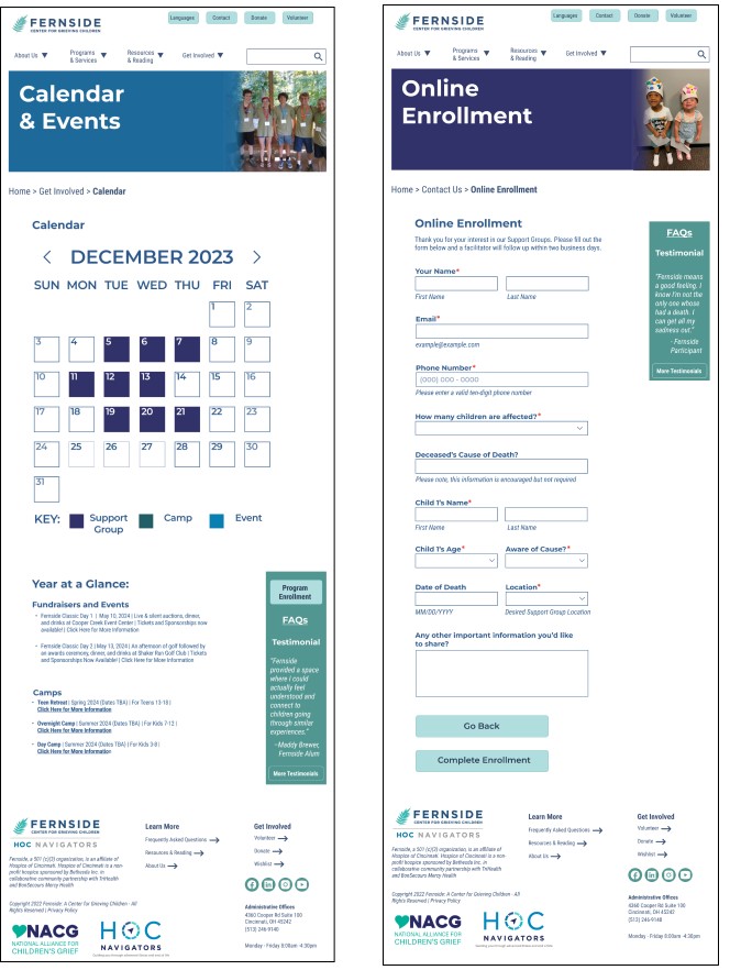
We iterated mid-fidelity prototypes for Desktop, Tablet, and Mobile versions. Maddy was responsible for the mobile layout, Jennifer was responsible for the desktop layout, and Kelly was responsible for the tablet layout.
Desktop

Tablet

Mobile

Using our Style Guide, we iterated our prototypes to apply the colors, typography, and iconography, creating high-fidelity wireframes. Only the mobile and desktop versions were rendered into full prototypes. The mobile prototype was utilized to perform user testing.


Through this website redesign, we improved navigation, ensured color accessibility and consistency, and enabled online enrollment, aiming to boost Fernside's enrollment rate and provide a more reassuring experience for individuals navigating the grieving process.
Owing to the constraints imposed by time and the delicate nature inherent to the subject of grief, our research was precluded from conducting interviews and evaluations with families embarking on their journey of bereavement. For subsequent iterations of this project, we aim to engage directly with the demographic utilizing the Fernside.org website by facilitating interviews and assessments, thereby ensuring our research encompasses the perspectives and needs of those experiencing loss.
Furthermore, it was our intention to garner additional feedback from various grief support centers to enrich our understanding of the successful strategies employed within their programs. Regrettably, numerous centers did not respond to our requests for commentary.
Discover how we reimagined digital space to nurture healing and support.
The Fernside Center for Grieving Children stands as a beacon of hope and healing amidst loss and grief in the Cincinnati Metropolitan Area. Our case study unveils the journey of transforming their website into a fountain of resources and support, underlining an easy to find and use online enrollment process at the heart of our redesign.
