


We have observed that existing family planning and task management apps fall short in user-friendly design, collaborative functionalities, and engaging elements that motivate household task participation. Consequently, parents often feel overwhelmed in their efforts to maintain order and balance at home.
How might we aim to develop a solution that enables parents to manage their households more effectively, alleviates stress, and cultivates a happier, more cohesive family atmosphere? Success will be measured by consistent app usage, alongside positive user feedback in reviews and surveys
The team consisted of three members. My individual responsibilities were:
Additionally, I assisted in the definition and ideation processes, sketching, and animations in the hi-fi prototype.
We began by creating a proto persona of Jane Johnson, a working mom with school-aged kids trying to run her household effectively. She finds that she lacks a sufficient aide to help keep her household members organized and motivated when it comes to contributing to household tasks.

We undertook secondary research by meticulously reviewing and annotating key insights from seven articles focused on children's involvement in chores, organizational strategies, and calendar utilization.
Furthermore, we surveyed 12 users to explore the allocation of household tasks and interviewed 5 users to gain a deeper understanding of parents' daily routines and the challenges they face balancing household duties and activities.
In addition, we performed a competitor analysis of five other apps that specialize in chore management or calendar functions, to identify gaps in the market and opportunities for innovation in our app design.
We analyzed 5 apps revolving around chores and calendar creation, and found that they were either overly simplistic or needlessly lengthy in tutorials. Most featured bright colors and playful imagery.
Homey stood out with its family profile feature, enhancing a sense of a family unit.
Levelty and TaskieHusky organized tasks into categories for better structure, with Taskie Husky presenting a cleaner design that significantly inspired our app.
Chorsee excelled with its task creation panel, incorporating a built-in calendar and reminder feature.
Visual Daily Schedule was the most underwhelming, prioritizing the promotion of premium plans over user experience.

We launched a survey to understand household organization and task distribution dynamics, receiving responses from 12 participants

We interviewed 5 parents of school-aged children, asking questions regarding daily routine in the household as well as task allocation and organizational methods when it comes to chores and other tasks in the house. As user researchers, we want to understand parents' household routines and how hectic life can get between chores and activities.
After conducting our interviews, we consolidated the feedback into an affinity diagram and subsequently transformed this data into an empathy map.

We employed the "I like, I wish, What if" ideation technique and voted on features that resonated with us most. Subsequently, we organized these features based on priority and feasibility, identifying an inclusive “hub” page, a space for clarifying task expectations, and user-friendly reminder settings as our top priorities.

We then explored a day in the life of our persona, Jane, illustrating how our app, Happy Hive, could benefit her family. After a long workday, Jane returns home exhausted and irritable, only to find that household chores have been neglected, leading to arguments that frustrate everyone and leave her feeling let down.
When her partner discovers Happy Hive, they see a new hope for organizing tasks and clarifying expectations for each family member. The app successfully keeps Jane's children and spouse on track with their chores, resulting in a happier, more harmonious household for all, especially Jane.

We asked 5 users to navigate our app to create a family and user profile, and add a task, event, and reminder.
Each member of our team sketched out our ideas for the redesign of the app, using a mobile-first approach.


We iterated mid-fidelity prototypes, voting on our favorite features from each of our sketches and utilizing them to create the initial design of our app.

We opted for a vibrant color palette featuring oranges and yellows, aligning with our bee theme. Informed by color psychology, these choices aim to boost mental activity and evoke feelings of happiness, stimulation, fun, and energy among users engaging with our app.
Poppins was selected for our body font due to its fun and straightforward sans serif style, with a name reminiscent of a well-known fictional nanny, aligning perfectly with our app's ambiance. To complement this, we chose Lora as our headline font, offering an elegant contrast to Poppins' simplicity.


We conducted contrast and accessibility tests across our color palette to ensure our app meets WCAG accessibility standards. Our findings confirmed that all colors are fully accessible when paired with black text.

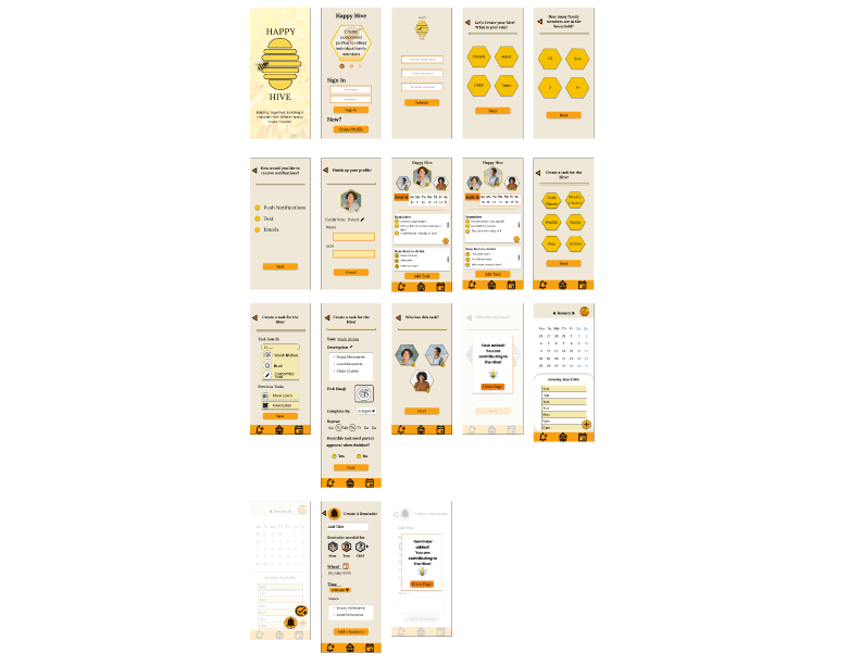
Using our Style Guide, we iterated our prototypes to apply the colors, typography, and iconography, creating high-fidelity wireframes.
Through this app design, we successfully implemented reminder and calendar features, which we found to be highly desired features through our surveys, interviews, and testing.
Owing to the constraints imposed by time, we were limited in our ability to test and iterate extensively, suggesting that our product has significant potential for improvement with further refinement. Our user testing had limited reach, and including parents with children of varied ages could have enriched our feedback for a more comprehensive understanding.
Our plans for future iterations include:
In response to an observed need for a more intuitive, collaborative, and motivational family planning tool, our team embarked on the Happy Hive App Design Concept project.
The Happy Hive App reflects our commitment to designing a solution that not only addresses the logistical challenges of household management but also strengthens the family unit by encouraging collaboration and mutual support. Our project, while still in the design phase, sets the groundwork for an app that promises to make household management a more organized, engaging, and harmonious experience for families.
